
Full redesign of Polestar Pilates: Raising conversion through strategic UX

  • UI
  • Prototype
  • Landing Page
  • Design System

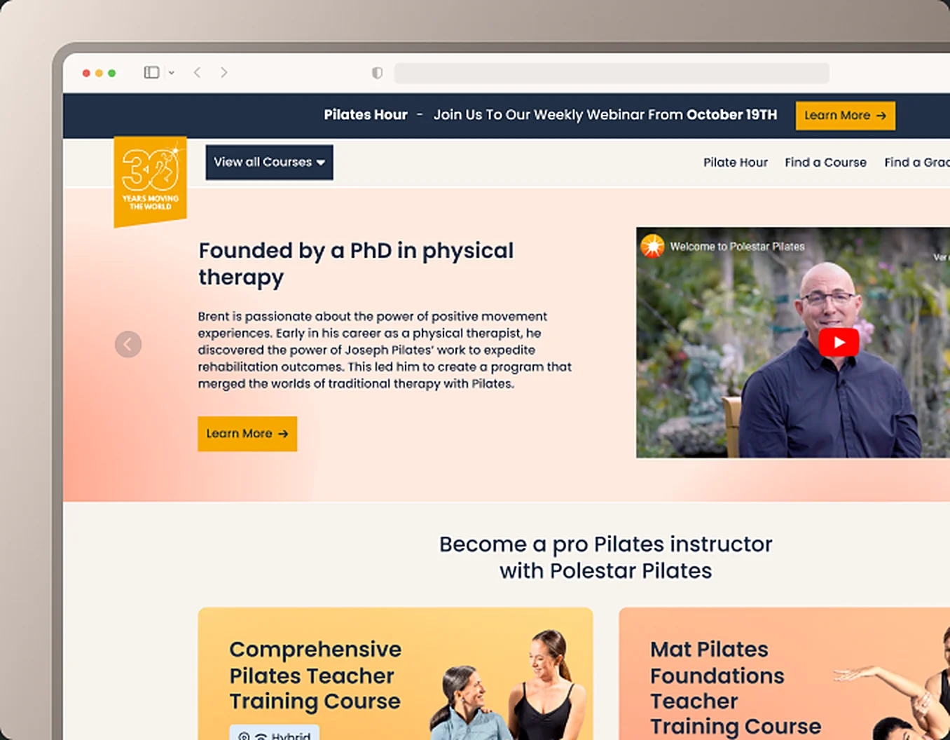
More than a visual redesign, this project was a strategic intervention to transform a Pilates education platform where 70% of the drop-offs were concentrated on the home page. My role as UX/UI and Product Owner was to align the value proposition with the real needs of the user in order to maximise course sales.

2025Launched by Polestar Pilates

The challenge: beyond aesthetics

The problem was not only visual; it was a bottleneck in the conversion funnel. Users left because the cognitive load was excessive and the key information stayed hidden.

  • Strategic prioritisation: Instead of a blind redesign of everything, we identified that 70% of the drop-offs were concentrated on the home page, so we focused the effort on a simpler information architecture there.
  • Business impact: The goal was to move from an "informational platform" to a "conversion machine" where every click had a clear intention.

Validation with users: why this path?

How did we know the new flow would work? Not through internal consensus, but through evidence. We used Useberry to test flows with real users. That let us confirm that the new structure guides the student towards the purchase in an intuitive way, and that it removes the friction that used to create distrust.

The design system as an engine for scalability

A robust design system is the difference between a project that breaks as it scales and one that grows in an orderly way.

Beyond 'the visual', we built a system oriented towards scalability. Loading states and reusable components did not only improve the UI, they also reduced the technical friction during implementation.

Handoff: real collaboration with development

The success of the project depended on close collaboration with the 4 developers on the team. Our way of working kept the design from getting "lost" in the translation to code.

We delivered files with defined loading states and technical annotations, so the development team never had to guess the interactions and could focus on the efficiency of the product.

Results

  • Less friction: Optimisation of the onboarding flow in order to reduce the bounce rate.
  • Clearer information: Information architecture centred on what the user needs in order to make the purchase decision.
  • Technical optimisation: Better perceived performance through loading states defined from the design.
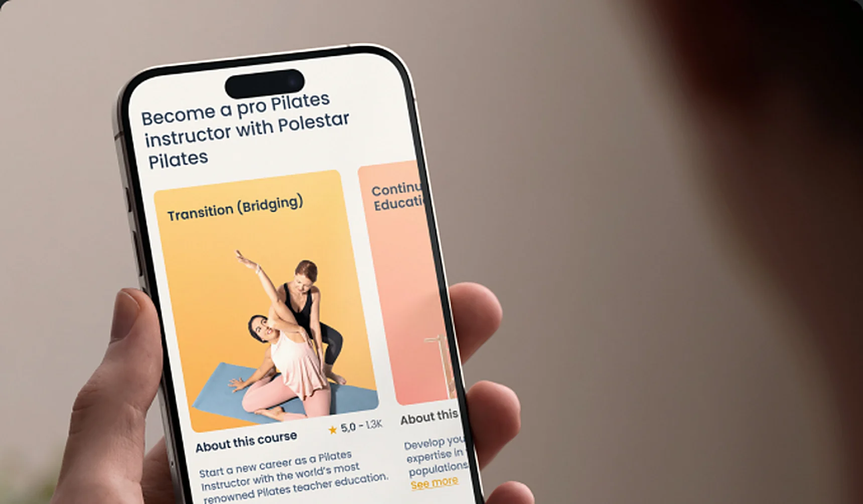
The Polestar Pilates course app on an iPhone
Redesigned home page of Polestar Pilates
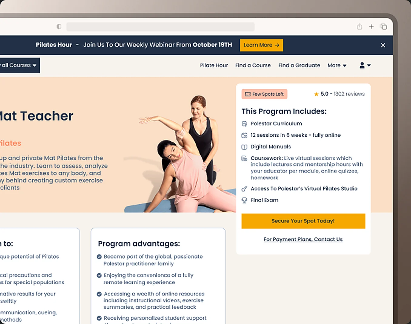
Mat Teacher course page of Polestar Pilates
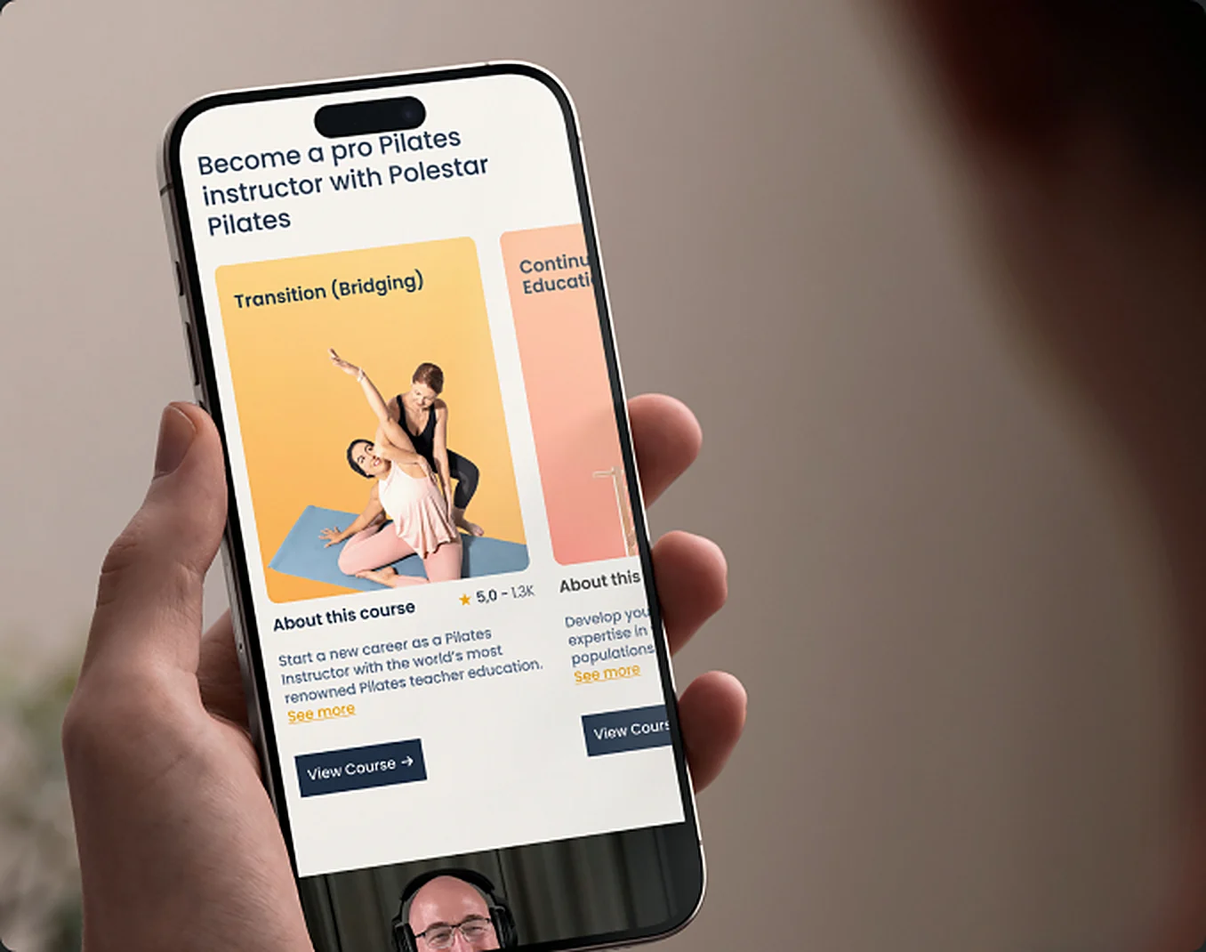
Detail of the training programme in the Polestar app